Customer Churn Analysis Case Studies
Deep strategic analysis through intelligent customer segmentation
Choose a Case Study
Usage Frequency: The Hidden Story
What Your Data is REALLY Telling You
Behind every statistic lies a customer behavior pattern. Behind every pattern lies a business transformation opportunity.
The Shocking Truth Your Numbers Reveal
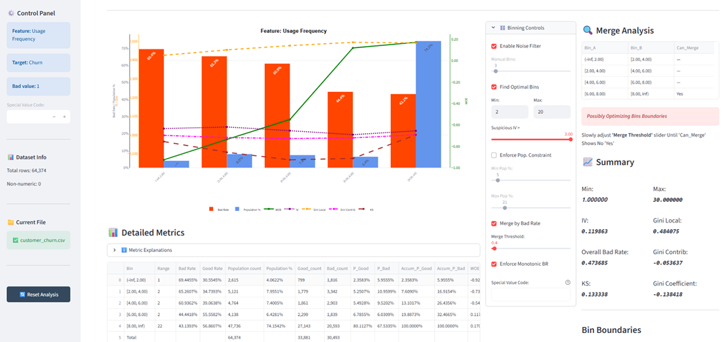
Critical Discovery: You Have a Product-Market Fit Problem
Your IV of 0.12 is classified as moderate, but in the context of a behavioral feature like usage frequency, this is actually ALARMING.
Why this matters: Usage frequency should be one of your STRONGEST predictors of churn. In healthy SaaS businesses, usage frequency typically has IV values of 0.3-0.5+. Your 0.12 suggests even your active users are not that sticky.
The real problem: You are not just losing disengaged customers - you are failing to create genuine product dependency even among frequent users. Look at your power users (8-30 uses): they STILL have 43% churn. That is catastrophic.
What Good Looks Like
Your Current Reality
Core Insight: This is not a drive more usage problem. This is a our product does not create irreplaceable value problem.
The Mathematical Story Behind Your Bins
Understanding Weight of Evidence (WOE)
WOE tells you the strength of belief that being in a particular bin predicts churn. Your WOE progression reveals something fascinating:
The Critical Observation
Notice the ASYMMETRY in your WOE values. The negative WOE in low-usage bins is MUCH stronger than the positive WOE in high-usage bins.
Translation: Low usage is a STRONG predictor of churn, but high usage is a WEAK predictor of retention.
What This Means
Your product creates PAIN when absent (hence strong negative WOE for low usage), but does not create IRREPLACEABILITY when present (weak positive WOE for high usage).
This is the signature pattern of a nice-to-have product, not a must-have product.
The IV Contribution Analysis
Strategic Insight: 63% of your predictive power comes from just the first two bins (12% of customers). But focusing only on reactivating dormant users ignores the elephant in the room - why are 74% of your power users still churning at 43%?
The Negative Gini: Your Smoking Gun
Gini Coefficient = -0.138: What Everyone Gets Wrong
Most analysts see a negative Gini and think good, inverse relationship confirmed. That is surface-level thinking.
A Gini of -0.138 means your usage frequency has WEAK rank-ordering power for separating churners from non-churners.
For context: A perfect predictor would have a Gini of -1.0 or +1.0. Yours is barely 14% of the way there.
What a Strong Gini Would Mean
Clear separation between churners and retainers across all bins
Usage frequency alone could drive strategic decisions
Simple interventions (drive usage up) would work
ROI on campaigns would be predictable
What Your Weak Gini Means
Usage frequency alone is insufficient for prediction
Other hidden factors drive churn MORE than usage
Simply increasing usage will not fix the problem
You need a multi-dimensional strategy
The Deep Insight
Your weak Gini combined with WOE asymmetry tells a specific story: Usage is a necessary but insufficient condition for retention.
Think of it this way: Low usage guarantees churn (strong negative WOE), but high usage does not guarantee retention (weak positive WOE + weak Gini).
You are trying to solve a retention problem with an engagement solution. But your users are engaged AND STILL LEAVING. This means the problem is value delivery, not feature discovery.
The Questions You Should Ask
1. What are power users DOING during those 8-30 uses that still does not create stickiness?
2. What alternative solutions are your churning power users switching to?
3. Is usage frequency measuring the RIGHT activity, or just ANY activity?
4. What would make your product irreplaceable regardless of usage frequency?
The 74% Paradox: Your Biggest Blind Spot
Everyone Celebrates 74% Being Power Users. That Is the WRONG Focus.
Here is what no one is telling you: Having 74% of customers in the 8-30 usage bin with 43% churn is DISASTROUS.
The Math Everyone Is Ignoring
20,593 customers used your product 8-30 times and STILL left.
That is 67.5% of ALL your churned customers (20,593 out of 30,493). Your power users represent TWO-THIRDS of your churn problem!
Standard Playbook
- Focus on dormant user reactivation
- Drive users to 6+ uses milestone
- Celebrate high power user percentage
- Build onboarding to increase early usage
What You SHOULD Do
- Deep-dive WHY power users churn despite usage
- Identify quality usage vs quantity
- Find what makes the 56.86% who stay different
- Redesign value delivery, not feature discovery
The Strategic Reframe
Stop asking: How do we get people to use more?
Start asking: What job are our power users failing to accomplish even with 8-30 uses?
Strategic Action Plan
Stop Optimizing for Usage. Start Optimizing for Irreplaceability.
Here is your actual strategic roadmap based on what the data is REALLY telling you:
IMMEDIATE: Power User Churn Investigation (Week 1-4)
Action 1: Interview 100 churned power users (8-30 uses). Why did they leave despite high engagement?
Action 2: Compare retained vs churned power users. What differs beyond usage frequency?
Action 3: Map the jobs-to-be-done. Are users accomplishing their goals or just going through motions?
Expected Output: Root cause analysis of why usage does not equal retention
SHORT-TERM: Value Delivery Redesign (Month 2-3)
Action 1: Identify what quality usage looks like (outcome-driven vs activity-driven)
Action 2: Build integration moats - what would make switching painful?
Action 3: Redesign onboarding to focus on outcome achievement, not feature tours
Expected Output: New value delivery framework that creates switching costs
LONG-TERM: Product Strategy Pivot (Month 4-6)
Action 1: Shift metrics from usage frequency to outcome completion rate
Action 2: Build features that create network effects or data lock-in
Action 3: Develop multi-dimensional churn model (usage + value realization + integration depth)
Expected Output: Sustainable competitive advantage beyond feature parity
The ROI Case
Final Word: The Uncomfortable Truth
Your data is screaming that you have a fundamental product value problem disguised as an engagement problem. The companies that win are not those with the most engaged users - they are those with the most irreplaceable products.